6 of the most common retail lighting design mistakes
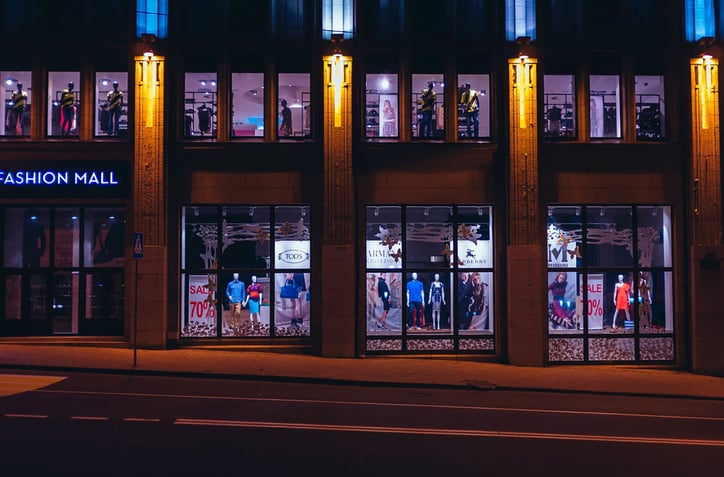 Lighting is one of those things that can be easily taken for granted. It’s sort of like cell phone service or drinking water – it’s not something most people pay attention to unless it’s off.
Just like cellular networks and purified drinking water, details matter in lighting. Ensuring a cell signal isn’t spotty or that the total dissolved soluble content of water is palatable is a science. And it’s pretty easy to mess up.
With lighting, mistakes rarely go unnoticed. And even the less-noticed ones can have a trickle-down effect on sales.
The job of the lighting designer is to help you avoid such oversights, ensuring your lighting is sharp, consistent, and right for your brand.
In that spirit, here are the most common mistakes our team sees in retail lighting design:
1. Failure to accent focal points and features

When retail stores fail to use appropriate lighting to highlight the products they’re trying to move, its effort to drive sales in a certain direction is incomplete. End caps shouldn’t be bygone and forgotten in the shadows.
By the same token, highlights on new products shouldn’t be neutralized by overhead lighting. Too much general lighting in the store is an all-too-common mistake in today’s retail stores that prevents customers from being drawn to the products you want them to focus on. The bottom line: everything in a retail store should not be lit the same. End-caps and featured items are meant to be lit by accent lights.
Keep in mind that simply installing accent fixtures in an open space won’t provide the right kind of general light needed to keep a store well-lit. You need the right ratio of general light and well-focused accent light.
2. Poor balance of contrast
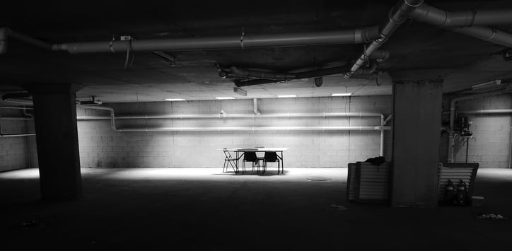
Piggybacking off of the above point, some stores fail to use lighting contrast in a way which draws people to specific areas of its space. Costco is a good example of that. While the even lighting throughout their stores hasn't necessarily impaired their ability to move an acceptable volume of product, their lack of contrast limits their ability to strategically direct sales.
On the other hand, stores with dramatic lighting contrast like Abercrombie & Fitch and Hollister may have too much of a good thing going, with extreme contrast making it hard to focus on items in the dark or in the spotlight.
3. Failure to consider lighting codes

You may not have the kind of palate which can discern the differences between Evian and Aquafina water, but there are probably plenty of folks who work for the FDA who can dissect the mineral composition of the waters, pointing out flaws and imbalances when they find them. Just the same, there are some retail lighting design mistakes that will go unnoticed by your customers but will be easily detected by inspectors.
Why does it matter? Failure to consider lighting codes upfront can cost a lot of money down the road with failed inspections, delays, add-ons, additional installation costs, and other similar headaches. Lighting codes simply cannot be an afterthought, but carefully considered throughout the design phase of a project and closely managed during buildout.
4. Failure to consider light color during the design phase

What’s the theme or feel of your store? Is it sleek and clean? Homey and rustic? Lighting color can make or break that feel. Furthermore, different displays within the same store may require different lighting color to best jive with the designer’s intent. In a jewelry store, for example, white gold, silver, platinum, and diamonds should be lit by cooler light while yellow gold and certain gems should be illuminated with warmer tones.
5. Use of old or inefficient technology
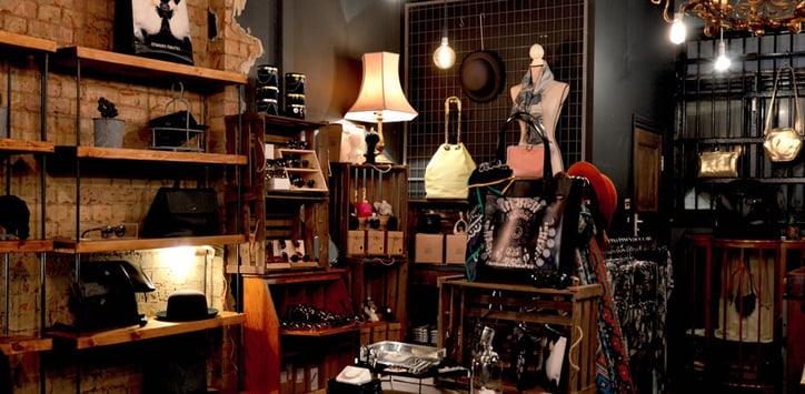
Old, inefficient lighting technology will not only tear down the style of your store, but will well cost you a lot of money in energy, materials, and labor. Consider this: if you opt for a short-life, old, inefficient light, it will cost less up front, yes, but it will burn out on you sooner. Then, who knows how long it takes you or one of your employees to nice that the light is out? It’s more likely that a customer notices it before you do, which makes the store look bad. And once you’ve found it, your employee will then have to allocate time to locate the correct replacement and change it out.
The trickle-down can cause real problems, beyond just the high cost of energy, which is probably the biggest reason to go with newer lighting technology. The technology has advanced to a point where you can now achieve some of the design intent older lighting technologies provide without compromising on the financial and operational performance.
6. Failure to maintain existing lighting 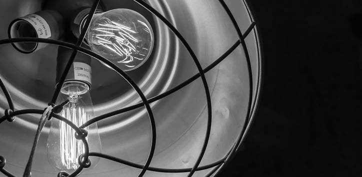
Relamping and cleaning the fixtures you invested in during your buildout is vital to maintaining a sharp, attractive store. You probably already knew that. But beyond that, it’s imperative that lamps get changed out promptly and on schedule. Ballasts and power supplies also need rapid replacement when they begin to fail. Too many businesses struggle to keep up with this kind of maintenance, diminishing the initial investment they made in their lighting, which will cost more down the road while dampening visual appeal and efficiency.
